Data Pipelines Dashboard
ActionIQ
Summary
I designed a new Dashboard that allows users to monitor their customer data’s health and recency. Working with backend engineers and end-users, I translated backend processes into content that is easy to digest.
This Dashboard gained 73% adoption rate within the first 90 days.
Background

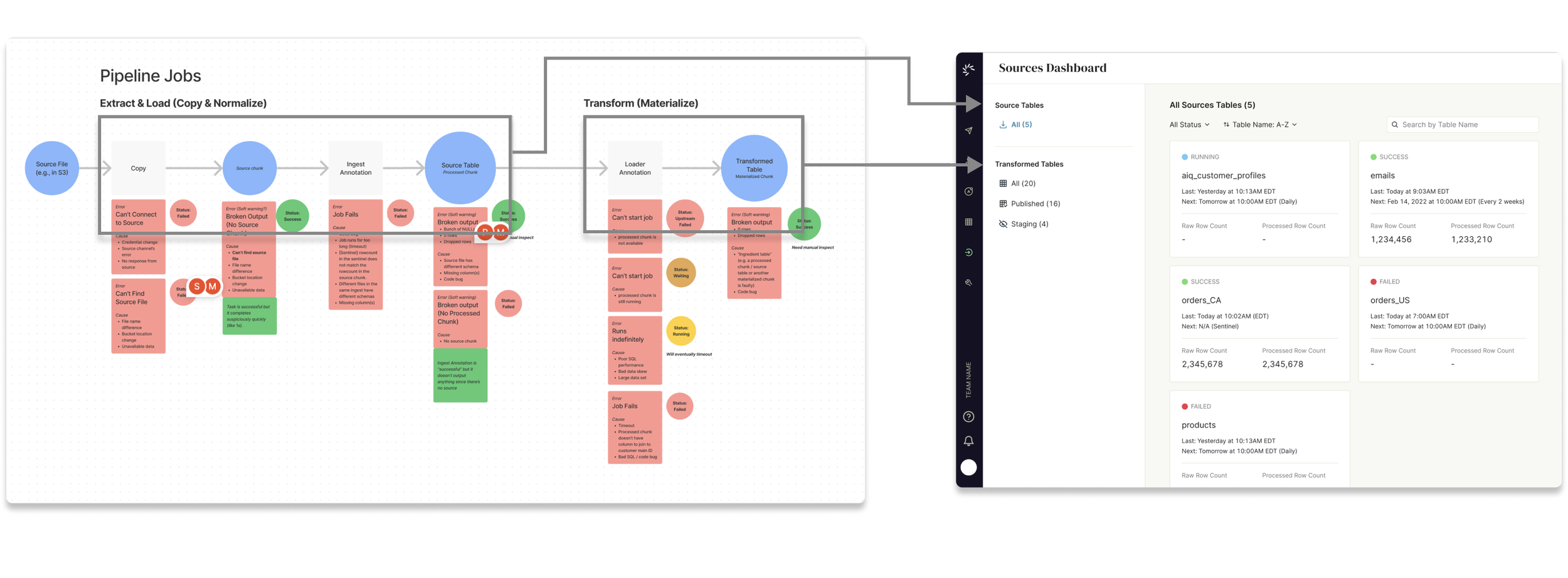
ActionIQ’s platform ingests & unites clients’ customer data from multiple sources at varying cadences. However, at the time, this process was hidden in the backend, and end users could not tell if their ingest jobs are successful.
The objective of this project was to build a Data Pipelines Dashboard for technical users (data engineers, project managers), that would enable them to monitor the health of their data in ActionIQ.
Role
UX & UI Design – Simplified under-the-hood data processes into a dashboard that would show the health and recency of users’ data.
User Research – Conducted discovery user research & usability testing
Research
What information do users need to know?
I worked with internal Backend and Data Engineers to map ActionIQ’s data pipeline processes and the different possible failures. Afterwards, I conducted several user interviews to learn more about what information they need to know when monitoring data pipelines, and to test my design prototypes.
Design Outcomes
Simplifying Information
Based on user interviews, users need to understand their data dependencies (e.g. Table A depends on Table X), on top of ActionIQ’s internal data processes. These could be esoteric and not easy to digest. So, to simplify the information on the Dashboard, I worked with backend Engineers to:
Identify outcomes of these data processes
Identify points where failures could happen
Using these insights, we rolled up our processes into 2 main objects of interest: (1) Source Tables, (2) Transformed Tables. We designed the Dashboard to be object-centric, rather than job-centric.
Monitoring
Through interviewing users, we discovered two key questions users need to answer when monitoring their data:
Health: Are my tables ingested into ActionIQ successfully?
Recency: How fresh is my data?

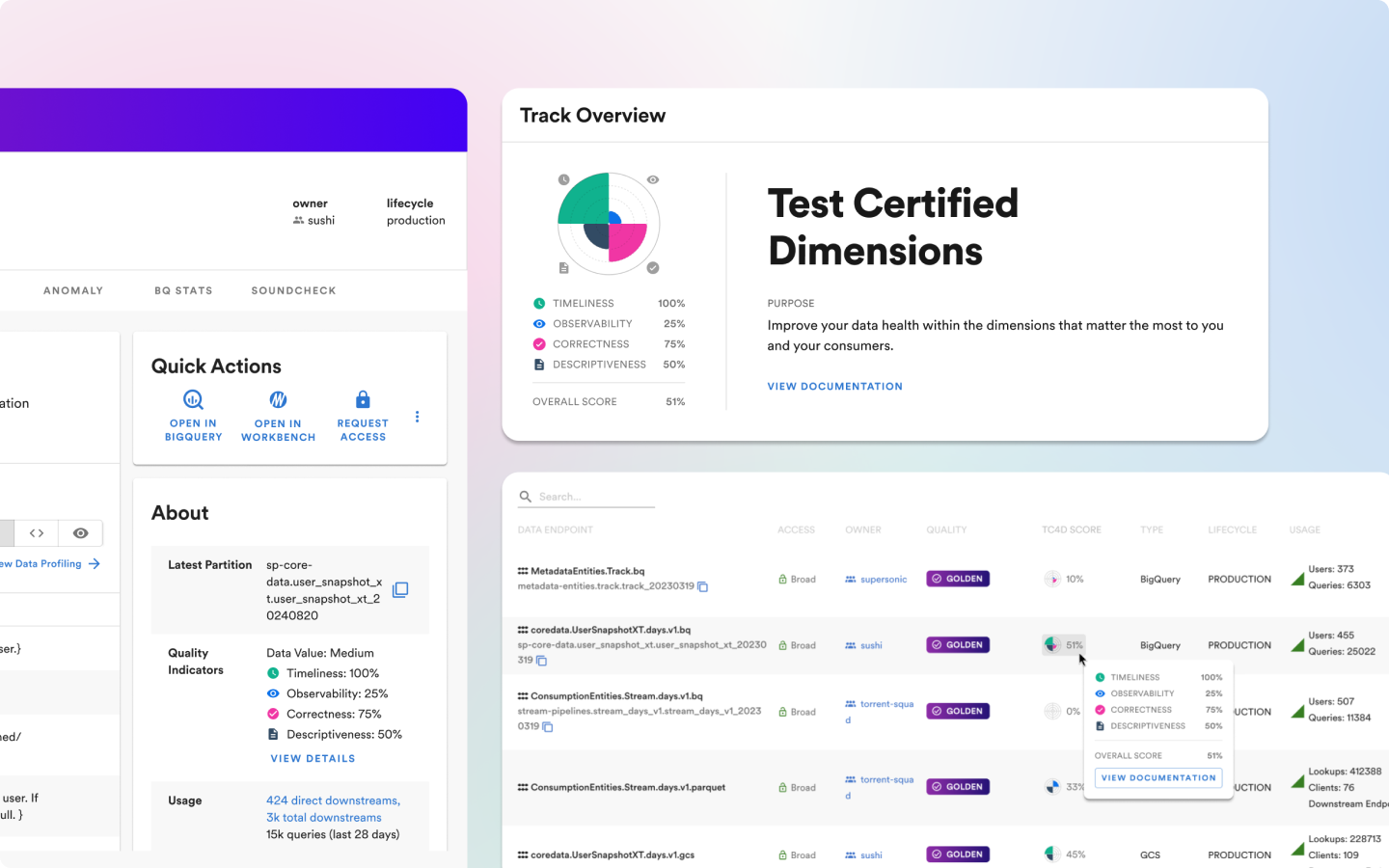
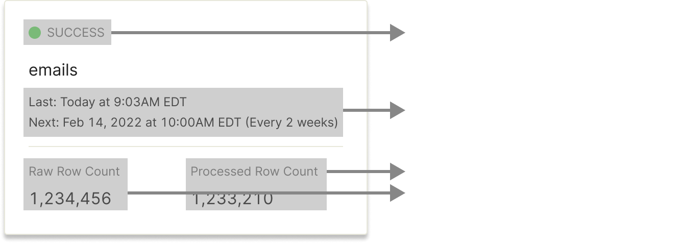
I designed a Dashboard with cards that represent a Source or Transformed Table. Each card contains information needed to discern health & recency of Table.
Additionally, I added search, filtering & sorting to make finding specific Tables and issues easier.
Acting on Failures
Due to the high frequency and volume of data ingest jobs, failures happen all the time. As part of monitoring data health, users need to be able to (1) diagnose a failure, (2) trace data lineage to find the root and downstream impact, and (3) understand the remediation step.
Using the Dashboard, users can investigate a failure by clicking on the relevant card, which brings them to the Table’s Detail Page. On this Detail Page, users can read the complete error message and investigate the root & impact of failure using the dependency list.
Impact
73%
Adoption rate within first 90 days
“In general, the dashboard is very arranged, clear and readable. Also, the options to search for a specific table and sort the tables according to different logics are helpful and convenient.”
– End-User Testimonial
“I use the dashboard to tell my customers that they are wrong!”
– Internal Customer Data Engineer