Comp. Typo | Hanzi-ish(?)
I use a lot of trendy bold-but-sleek sans-serif typefaces in my graphic design work because (a) I’m a sucker for trends, and (b) I like the silhouette the letters make. So, for this assignment, I wanted to make letters that are as graphical. I also wanted to make something that feels organic because I just don’t like hard corners in my letterforms.
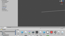
I started out drawing a squiggly line.
beginShape();
curveVertex(10, 26);
curveVertex(15, 25);
curveVertex(30, 26);
curveVertex(40, 27);
curveVertex(52, 26);
endShape();

This is a line that goes from (10, 26) to (52, 26), but has many vertices with slight y-variations in between.
To make it organic, I drew another line with different strokeWeight, and randomizes the vertices’ x coordinate a little.
strokeWeight(2.5);
beginShape();
curveVertex(10, 26);
curveVertex(40, 25);
curveVertex(15, 26);
curveVertex(40, 27);
curveVertex(52, 26);
endShape();

Satisfied with how this stroke looks, I wrote a system that draws multiples lines to create a letter. This is how the system works:
Create 5 coordinates that fall on single horizontal line, but with randomized x-position increment.
Create slight variation (-1 to 1) in the y-coordinates
Draw a line with thin stroke across these coordinates
Draw a thicker line across the same coordinates but in random coordinate order.
Repeat the steps above 3-5 more times, each time moving the “brush” down by 6 pixels.
Repeat for 2 more times, but draw vertically instead of vertically.
And I put it inside Allison’s grid example, made some interaction using mouse position, and here it is:
(Move your cursor and click to generate different shapes.)
Because I made the variation value increase/decrease based on mouse position, the letterforms randomness can vary as well. They turn out looking more like Hanzi/Kanji characters than trendy latin character typefaces. That said, I really like it when the variation is very slight or very big.


